What Makes a Good Logo?
Strip away the design jargon and a good logo does three jobs. It gets noticed among competitors, it gets remembered after the moment has passed, and it stays consistent enough that repeated exposure builds up in a customer's memory instead of resetting each time. None of those three jobs requires the mark itself to be beautiful in any grand sense. A logo that is merely simple, distinctive and used consistently will outperform a logo that is intricate, clever and changed every eighteen months.
This is where a lot of small business owners go wrong at the brief stage. They ask a designer for something that "tells our story" or "captures everything we do", when the honest job of the mark is much narrower. A logo is a flag, not a mission statement. Think of the small differences between two furniture makers in the same town. One has a simple carved-wood monogram that appears the same way on every invoice, van and Instagram post. The other has a detailed illustration of a workbench with tools scattered around it, redesigned twice in three years because it "didn't feel finished". The first is doing its job. The second is asking customers to relearn who the business is every time it changes.

Why Simplicity Wins in Logo Design
Simplicity is not a stylistic preference, it is how recognition works. Peer-reviewed consumer research examining logo shape has found that people respond more positively to marks with natural, organic-feeling forms, which tend to be simpler and easier for the eye to resolve at speed than busy, geometric or overworked designs, according to a study on logo naturalness and consumer response. The underlying mechanism is fluency. A shape the brain can process quickly gets liked more quickly, and a shape that takes effort to decode gets a smaller, cooler reaction, however clever the concept behind it felt in the studio.
For a small creative business this has a direct, practical consequence. A logo has to survive being shrunk to the size of a favicon, printed on a till receipt, embroidered on a jumper and glimpsed for half a second on a phone screen while someone scrolls past a hundred other posts. A detailed illustration that looks wonderful blown up on a shopfront often collapses into an unreadable smudge the moment it gets small, while a simple wordmark or a single clean icon holds its shape at every size. If your logo needs a paragraph of explanation before someone gets it, it has already failed the only test that matters, which is whether a stranger recognises it half a second from now, on a train, without you there to explain it.
A Logo Is One Asset in a Bigger Brand System
A logo carries less of the load than most owners assume, and it is worth being honest about that early, because it changes how much time and money is sensible to spend on it. A brand is the fuller picture, the feeling a customer has about your business built from every interaction, not the mark alone. The logo is one recognisable asset inside that picture, alongside your colours, your typeface, the tone of your captions and the way you answer the phone.
This is why the research on how brands get remembered focuses on the whole set of distinctive assets a business builds and holds consistently, as the Ehrenberg-Bass Institute's ongoing work on distinctive brand assets sets out. A specific shade of colour, a consistent typeface, a recurring phrase and a steady logo together do far more work than a beautiful logo carrying the whole brand alone. A ceramics studio in Bristol that uses the same warm terracotta shade on every packaging box, the same hand-drawn wordmark on every label and the same closing line in every email builds recognition through repetition across all of those touches, not from the logo working overtime by itself. Treat the logo as one piece of a small, consistent set rather than the single thing that has to do everything, and the whole system becomes easier to hold together and cheaper to run. For the wider thinking behind that set of choices, our guide to brand strategy covers the decisions that sit above the logo, and personal branding covers the same principle for a business built around one person's name and face.

How Colour and Shape Shape Recognition
Colour and shape do real work in a logo, but be careful with the numbers that get thrown around to justify design decisions. A widely repeated claim in design marketing states that colour increases brand recognition by 80 percent, and it gets used to justify all sorts of colour choices with a false air of scientific certainty. When the claim is traced back to the study it is supposedly drawn from, it does not support that figure in any straightforward way, as a detailed analysis of the original research shows. That is worth knowing before you let a bold statistic push you toward a colour you would not otherwise choose. Colour matters because it is one more consistent signal, not because a magic number guarantees an outcome.
What genuinely helps is choosing a colour and a shape family that are distinctive within your own category and then holding them without wavering. If every accountant in your town uses navy blue, a small independent bookkeeper who commits to a warm ochre and keeps it on every invoice, van sticker and social post for three years will be easier to spot than one who follows the crowd into navy and hopes cleverer copywriting makes up the difference. Shape works the same way. A rounded, friendly mark suits a children's soft play business in a way it would not suit a structural engineering firm, and the fit between shape and category matters more than any individual shape being inherently better.

How to Brief or Design a Logo, Step by Step
Get the positioning right before a single sketch happens. Deciding who you serve best and why you deserve to win them against the alternatives they would otherwise choose comes before any design conversation, as the discipline of positioning sets out. A logo brief written without that decision in place asks a designer to guess at things that are yours to decide.
- Get your positioning straight first. Write one plain sentence about who you serve best and what you want to be known for. Every design choice that follows should be measured against this sentence.
- Write a one-page creative brief. Name your audience, your three closest competitors, the one or two words you want the logo to feel like, and any hard constraints, such as needing to work in one colour or embroider well on fabric.
- Choose a design approach that fits your positioning. A wordmark, a simple icon, or a combination of the two. A brand-new business with an unusual name often needs a wordmark people can read and learn to say, while an established business can often carry a standalone icon once customers already know the name.
- Test the logo in the real world. Shrink it to the size of a phone icon. Print it in black and white. Put it on a mock invoice and a mock van door. If it survives those tests, it is doing its job.
- Lock the system, not the mark. Fix your colours, typeface and logo together as one small kit, and write down the exact colour codes so every future supplier uses the same ones.
- Register and protect it. Once you are happy, check the mark is not already trademarked in your sector before you print a thousand business cards with it.
Six steps, and a small creative business can move from a vague idea to a working mark without months of back and forth. What you are protecting throughout is consistency, because a logo only pays off once it has been seen the same way, many times, by the same people.

Common Logo Design Mistakes to Avoid
Most logo mistakes are not about bad taste, they are about impatience or overreach. Owners frequently ask a logo to explain the entire business, cramming in an icon of a product, a tagline and a slogan all at once, when a single clear idea held simply would travel further. Owners also redesign too often, chasing whatever style has become fashionable that year, which resets the recognition they were slowly building and starts the clock again from zero. A cafe that changes its logo every time the owner gets bored has effectively been a new, unknown business three times over in the eyes of anyone who was only half paying attention.
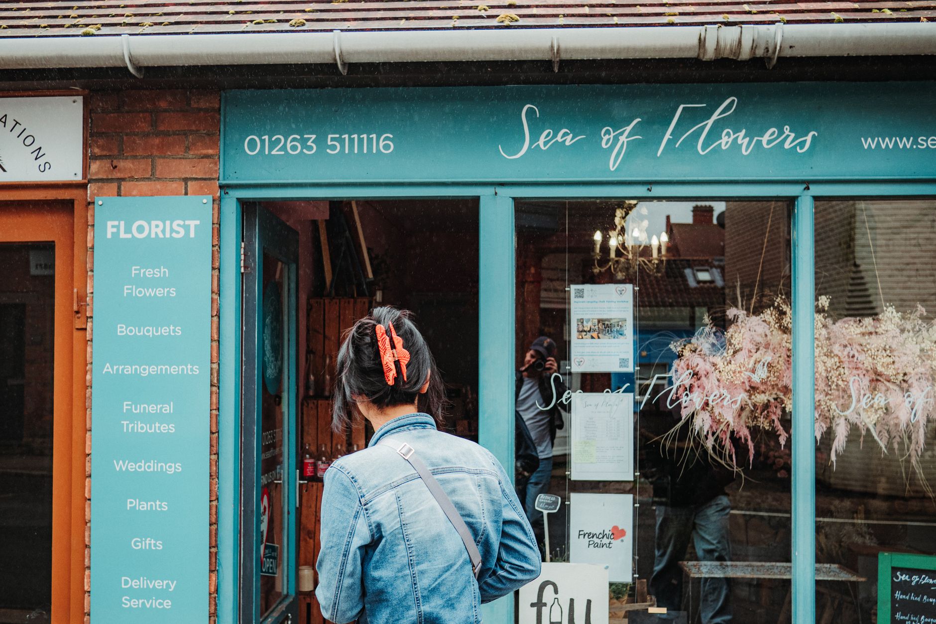
Another common mistake is choosing a highly detailed illustration because it looks impressive on a big screen, without ever testing how it holds up small. A florist's beautifully drawn bouquet logo that took a designer three weeks to perfect can turn into an unreadable blob the moment it appears as a tiny social media profile picture, which is exactly where most customers will see it most often. And a fair number of owners skip the trademark check entirely, only to discover months later that a near-identical mark already exists in their sector, forcing an expensive rebrand right when the original was finally starting to be recognised.
How Do You Know if a Logo Is Working?
A logo is working when people recognise it without your business name attached, and when it keeps showing up the same way across everything you do. Cover the name on your logo and ask a handful of customers, friends or people in a relevant local group whether they still know whose mark it is. If most of them do, the mark has done its job. If they need the name to tell them, it has more work to do.
The steadier way to check is to look at your own consistency rather than the design itself. Pull up your last twenty social posts, your invoices, your packaging and your van or shopfront if you have one. Is the logo, the colour and the type the same across every single one, or has it drifted, a slightly different blue here, a cropped version there? Recognition compounds from a mark being genuinely stable over time, which is the same principle behind why distinctive brand assets take years to build and can be undone quickly by inconsistency, as the research into how these assets accumulate value over repeated exposure explains. Check this once a year, tidy up any drift you find, and resist the urge to redesign simply because the mark has started to feel familiar to you. Familiar to the owner is exactly what recognisable to the customer looks like from the inside.